The Most Effective Ways to Test Websites for Responsiveness and Browser Compatibility
Testing websites across different browsers and devices is crucial to ensure a consistent and positive user experience for all visitors. In this article, we will discuss the most effective methods to thoroughly test websites for responsiveness and browser compatibility.
Browser Screenshot Services for Quick Validation
Browser screenshot services like BrowserStack allow developers to see previews of their website across various browsers and devices without having to install each browser. This provides a quick way to spot obvious issues. However, these services only emulate the browsers functionality and may not catch all potential problems. Still, they are useful for an initial validation pass to catch glaring inconsistencies. Using a browser screenshot service is one of the fastest ways to get a preview of how a website will look across different platforms.

Testing in Real Browsers is Most Accurate
For a more rigorous test, developers should install and try the website in actual browsers locally. The most popular browsers to test in are Google Chrome, Mozilla Firefox, Apple Safari, Microsoft Edge and Internet Explorer. Each browser renders content differently so testing locally ensures consistency. It is best to test on Windows, MacOS and Linux if possible to cover different operating systems too. While more time consuming than screenshot services, real browser testing is the most accurate way to discover rendering and functionality bugs.
Focus Testing on Top Browsers Bringing Traffic
Ideally, developers aim to support all major browsers. However, given resources it is impossible to test every browser and version. The browser market share should guide which browsers get priority. For example, if a website sees 90%+ of its traffic from Chrome, it makes sense to focus Chrome testing efforts there over lesser used browsers. As long as the top 2-3 browsers accounting for majority of traffic work well, lesser browsers can potentially be ignored if minor issues arise.
Try Different Screen Sizes and Resolutions
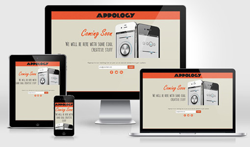
Websites need to adapt to various screen sizes from desktop to mobile. Developers can resize browser windows or use developer tools to simulate phones and tablets. Chrome also has an option to test across specific device form factors directly within the browser tools. Testing responsiveness at different breakpoints helps ensure content, designs and functionality transition smoothly across devices. This experience is especially important on mobile where screen real estate is limited.
Leverage CSS Frameworks for Cross-Browser Consistency
Using a CSS framework like Bootstrap, Foundation or Materialize provides a solid starting point to build websites that render consistently across browsers and devices out of the box. These frameworks neutralize differences in default browser styling. Developers can also customize the framework to suit specific designs. CSS frameworks streamline the process of achieving browser compatibility and responsiveness compared to starting from scratch.
Continual Testing Through Development & Post Launch
Browser compatibility issues may surface at any time, even after launch. Developers should setup monitoring to catch regressions and continuing testing occasionally on target browsers. New browser versions or updates could also break compatibility. Having a process to periodically replicate browser tests helps address any emerging problems and keep the user experience optimized over the website’s lifecycle. Testing for responsiveness and cross-browser compatibility needs to remain an ongoing practice.
In conclusion, the most effective way to test websites for responsiveness and compatibility is using a combination of testing strategies - initial validation with screenshot services, rigorous testing on real browsers, focus on high traffic browsers, simulating different screen sizes and leveraging CSS frameworks. With diligent testing practices implemented from start to finish, websites can offer users a cohesive experience across all channels.
